

Most researchers and policy makers interested in using poverty maps, and even those developing poverty-mapping methodology, are unaware of this bewildering array of methods. Such a wealth of options, however, invites the question: Does it matter which method is chosen? The answer is an emphatic “yes”, although one might suspect that most would prefer to remain ignorant rather than face an apparently impossible decision. The choice of method does matter; levels of disaggregation and drawing geographic boundaries matter; and the choice of indicator matters. All these elements can lead to a re-ranking of regions, communities or households, or lead to quite different policy conclusions. The fundamental problem is that little information exists on how much the choice of method matters, despite the fact that governments are spending billions of dollars a year, and millions of poor people either receive or are excluded from benefits as a result of these different poverty-mapping methods.
The assertion that the choice of method matters should not be surprising. Different methodologies use different data sources, assumptions and statistical routines. Few comparisons or sensitivity analyses of the different methods have been carried out, however. This lack of information constitutes a gaping hole in the analytical foundation of the emerging poverty-mapping movement. Although sophisticated statistical advances have been made for a variety of methods, little information exists as to the practical implications of choosing one method or another. What kinds of poor people in which regions are favoured by one method or another?
One of the few comparative studies compares the PROGRESA principal-components method with a method similar to community level small-area estimation (Skoufias, Davis and de la Vega, 2001). A marginality index was calculated that combined data from a national-expenditure survey and a census, based on the predicted probability of being poor for each locality. As before, the index was separated into five groups based on Dalenious-Hodges. This classification is compared with the PROGRESA index using a 5x5 matrix, as shown in Table 2. Small-area estimation results in a stricter categorization of poverty, implying that the small-area estimation method would be more appropriate in cases where avoiding leakage - including the non-poor as beneficiaries - is more important than avoiding under-coverage - excluding the poor. The correlation between the two methods tends to break down in the middle of the marginality spectrum, the medium-poverty category, signifying that the PROGRESA index loses power of distinction as marginality becomes less abject. This result has important implications for expansion of the programme beyond the most marginal communities.
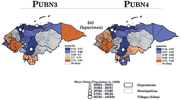
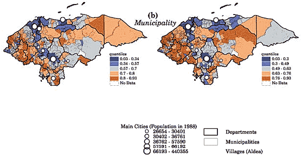
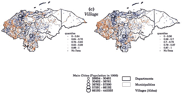
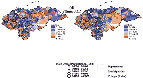
Some methods may be very robust and others quite sensitive to changes in the information included. Obviously, the more sensitive a measure is to small changes, the less confidence may be had in the results. An example of an extremely sensitive measure is the basic-needs method described earlier, employed with Honduras census data. Only a few variables are included in this index; in Maps 3A-D two indices are presented, distinguished by a single additional variable - educational attainment. The addition of this variable results in a re-ranking of marginality at all administrative levels.
TABLE 2
Categorization of marginally: PROGRESA versus small-area estimation
Small area estimation |
||||||||
Very Low |
Low |
Medium |
High |
Very High |
Total |
% |
||
Very Low |
613 |
3 473 |
3 |
4 089 |
5 |
|||
Low |
5 361 |
250 |
5 611 |
7 |
||||
PROGRESA |
Medium |
5 390 |
7 088 |
3 |
12 481 |
17 |
||
High |
83 |
15 819 |
682 |
16 584 |
22 |
|||
Very High |
6 104 |
27 770 |
2 357 |
36 231 |
48 |
|||
Total |
613 |
14 307 |
29 264 |
28 455 |
2 357 |
74 996 |
100 |
|
% |
1 |
19 |
39 |
38 |
3 |
1 |
100 |
|
Source: Skoufias, Davis and de la Vega (2001) |
||||||||
Even simpler circumstances can have important impacts in terms of poverty rankings, such as changing the level of disaggregation as measured by geopolitical groupings. As shown in Map 3, the basic-needs index is presented at three levels of geopolitical disaggregation in Honduras; in Map 2 it is the participatory index. The results illustrate that choice of level of disaggregation has important policy implications. A given level of disaggregation in each index would lead to a different allocation of targeted resources. The apparent increased precision evident in the maps may thus be deceptive, because it is unclear what errors are associated with these measurements. Which level is appropriate?
A major problem in spatial analysis is known as a modifiable area unit problem (MAUP). Units of area, whether administrative or political boundaries, agro-ecological zones or image pixels, are essentially arbitrary groupings, and the data within can be aggregated in an infinite number of ways (Nelson, 2001; Bigman and Deichmann, 2000a). This includes GIS-constructed data and any kind of spatially aggregated data such as censuses or household surveys. The practical implication is that alternative aggregations of the data may lead to different and conflicting results. In other words, the analysis soon becomes messy, and most practitioners would just as soon be ignorant of these awkward facts. This is true for simple visual correlation analysis as well as sophisticated econometric techniques. In terms of multivariate analysis, the relationship between dependent and independent variables may change over space in a manner that the analyst may not be able to determine a priori. Results can thus be purposely modified, or errors inadvertently made, through the process of aggregating data.
Nelson (2001) discusses a number of tools to minimize these effects. These include convolution filtering, in which a window moves over the data to produce a new data value, and different methods of zoning, including extending the concept of area units beyond preset administrative boundaries, or Euclidean distance to other measures such as time, accessibility, cost or energy that have more social or economic meaning. Nelson also explores a multivariate analytical technique, geographically weighted regression (GWR), which in combination with clustering techniques permits mapping of regression parameters and soundness of fit measures.11 Rogers (2000) describes the process of reasoning in avoiding MAUP for the West African Spatial Analysis Prototype (WASAP) project and impact evaluation in Zaire.
Map 3A
Two indices: Honduras, basic-needs approach

Source: Leclerc, 2002.
Map 3B
Two indices: Honduras, basic-needs approach

Source: Leclerc, 2002.
Map 3C
Two indices: Honduras, basic-needs approach

Source: Leclerc, 2002.
Map 3D
Two indices: Honduras, basic-needs approach

Source: Leclerc, 2002.
Few dispute the multidimensional nature of poverty and food security. Poverty mapping is by definition, however, about summarizing information in a few indicators, whether these are indices or single variables. A decision must therefore be made in each poverty-mapping application as to how to aggregate or how best to proxy food insecurity, and well-being in the case of poverty. While poverty and food insecurity are not necessarily the same phenomena, much overlap exists in terms of indicators.
Multiple indicators exist for poverty and food insecurity; there is an extensive literature on their strengths and weaknesses.12 Discussion here will be kept to a minimum and will focus on household measures. The choice of indicator may respond to philosophical preconceptions - the view that self-chosen, participatory or basic-needs indices are inherently better than economic indicators - to data limitations, or it may be the result of reasoned analysis of a given context. Analytical procedures range from statistical techniques to participatory studies in which poverty indicators are revealed by the population being studied. Information on most of these measures may be generated through surveys, secondary data, key informants/experts or a combination of these.
Poverty measures can be grouped into four major categories.
Food-insecurity measures can be similarly grouped into three categories.
The choice of indicator certainly matters, for both poverty and food insecurity. Numerous studies have shown that at the subnational level, different indicators can lead to alternative poverty or food-insecurity rankings.13 The choice of indicator thus has practical implications for results in terms of identifying the poor and their location. Care must be taken in poverty-mapping exercises not to assert a priori that one variable is better than another. It is far preferable to explore the trade-offs inherent in the choice of indicators: what assumptions must be made, and the practical implications in terms of costs, technical requirements, errors of exclusion and inclusion and the characteristics of the chosen population. While a full-scale comparison of the impact of alternative indicators in each exercise may not be feasible, all poverty-mapping efforts should at least justify or qualify the choice of poverty or food-security indicator.
11 The model and examples are discussed in detail in Nelson and Leclerc (2000).
12 See, for example, Ravallion (1992) and Maxwell (1999) for two among many on poverty measures, Maxwell and Frankenberger (1992), D. Maxwell (1996), S. Maxwell (1996) and Carletto (1997) for food security, and Henninger (1998) for a good review in the context of poverty mapping.
13 See, for example, Glewwe and van der Gaag (1988), Baker and Grosh (1994), Carletto and Davis (2000), Hentschel et al. (2000), Skoufias, Davis and de la Vega (2001) and Leclerc, Nelson and Knapp (2000).